More Design Tips
- • How “Category Creators” Inspire and Empower Customers
- • Draw People into Your Story with the Rule of Three
- • Three Steps to Great Design
- • Overcoming Obstacles in Design
- • Try Word Lists for Advertising “Gold”
- • Building the Perfect Letterhead
- • Attract Magazine Readers with Short-Form Columns
- • Essential Dos and Don’ts for Adding Beauty to Your Page
- • Grab Them Right Out of the Gate
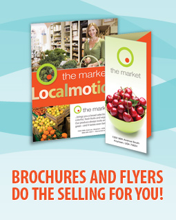
Suggestions for Designing Breakthrough Brochures

- Use color to focus attention on your main selling features and to improve the perception of quality. Two colors are better than one, and full-color printing is better yet.
- Using a glossy paper will often make your brochure look more professional.
- Avoid the temptation to try to jam too much information into a small space. In good brochure design, less is more.
- Don't overlook the value of white space to bring a clean look to your design and to help accentuate key selling points.
- For readability, consider using a serif type for body copy. Studies have shown that serif type is easier to read. Sans serif type is good for headlines and subheads.
Other Good Ideas:
- If you will be mailing your brochure as a self-mailer, consider applying a coated finish (varnish) to the printing. The coating will help prevent scuffing -- ink being rubbed off by the post office's mail-sorting equipment.
- For the best impression, consider mailing your brochure in a matching envelope.
- For a unique sales and marketing twist, consider applying a small label somewhere on the brochure to draw attention to a special feature, special pricing, a sales rep's name, or a toll-free number.


The Best of Brochure Design 5
by Rockport Publishers
The Best of Brochure Design 5 presents some of the world’s best designed brochures in a beautiful showcase for inspiration and admiration. Brochures are displayed in all shapes and sizes, all papers and printing, presenting incredible, innovative solutions to many design challenges. More than 200 examples are showcased, including brochures for corporate clients, used to promote products and services, and brochures for design and creative firms.
You’ll find lots of creative ideas here.

Share this